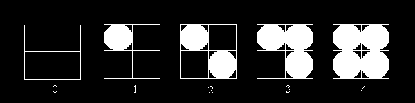
I think you agree that the pattern moves slowly between fully black and fully white. Now all we have to do for our full color example, is change the white and black colors used here, into the lower and higher color value. This 2 by 2 matrix gives us a way to display 3 in-between levels, so this matrix can be used for the Green component. The zero pattern would be the lower color, patterns 1, 2 and 3 would be the in-between levels and 4 would be the higher color.
Now we know about the pattern, but we still don't know if a pixel should
be the higher (lighter) or lower color (darker). To explain this, I will
use some pseudo code. To draw a pixel at position x,y we do the following:
i = x modulo 2
j = y modulo 2
Modulo is just the remainder left after the division e.g. 10 modulo 2 is 0 (10 = 2 * 5 + 0) but 11 modulo 2 is 1 (11 = 2 * 5 + 1). Now lets take an example: suppose that a pixel should be drawn at x = 10 and y = 11 with an intensity of 2 (so between the two colors).
So we would get:
i = 10 modulo 2 = 0
j = 11 modulo 2 = 1
Now we will look up position [0,1] in the matrix ([0,0] is top right, just a convention). That is the matrix position with number 2. Now the 2 at that location should be compared with our wanted intensity (halfway between the 2 colors is pattern 2). Since the intensity is not larger (2 is not larger than 2) than that value, we will write the black pixel or lower (darker) color value. If our pixel's color was brighter, we might need pattern 3 (3 is larger than 2), and then we would have written the white pixel or the higher (lighter) color value.
Using this technique, we can determine for each and every pixel, whether it should be the darker or lighter value. All you need is a mod operation and a lookup/compare operation. Different matrices and thus patterns exist, but in the end, the results and technique is the same.
Advantages:
The advantages of dithering are clear: more colors with fewer bits. Using only 16 bits of color, we can create the impression of having many, many more color levels. This technique works well in still images and also in 3D rendering. The main reason for doing this is the bandwidth reduction. Writing 16 bit color values to memory uses less bandwidth than writing full 24 or 32 bit color values. Thus, in the end, a higher frame-rate is possible thanks to dithering, with (according to some companies) only a minor reduction in image quality.
Disadvantages:
Nothing comes for free. That is the big rule in 3D acceleration. When you get a higher color resolution, you will have to pay for that with something else and dithering reduces the spatial resolution. Mainly, this means that because of dithering, the accuracy and fine detail is removed. Some dithering algorithms bring you nice color resolution, but the image looks very blurred. An example of a 3D Accelerator that sacrifices too much detail for higher color depth is the Voodoo. All colors look very smeared out and blurred partly due to dithering. Better Matrix Patterns can solve this problem only partially, since there is always a loss in spatial resolution. Its the price you have to pay.
Repeated dithering can result in weird interference patterns. I don't think this needs much elaboration. If you apply this technique over and over, you can get very weird results due to the dither patterns used. This problem can be partly solved by randomizing the start positions of the patterns (shifting the pattern). Still, repeatedly dithering an image (as can happen with multi-texturing) can lead to serious visual artifacts.
Surfaces with a single non 16-bit color will show a repeated dithering pattern. This dithering is very obvious since the same pattern is repeated over and over again, covering a large continuous surface. This is very annoying and ugly, but is often seen in games. A transparent HUD display may have a non 16 bit color and will thus show such a pattern. The same is true with other transparent windows and even explosions. Very often, the dithering pattern can be seen and this is annoying and even unwanted. Unfortunately, there are no easy solutions. We can just keep hoping that 3D games coders will use pure 16 bit color values for these large transparent surfaces.