
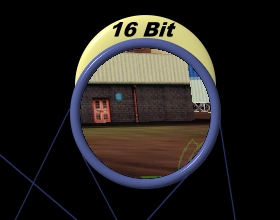
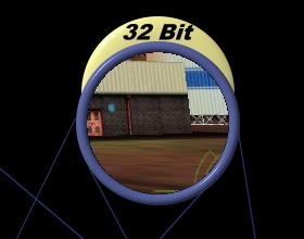
The sky detail shows the lack of sufficient colors shades very clearly. There simply isn't enough colors available to make the sky look nice and smooth. The 32-bit image doesn't seem to have any problems with this. However, the detail of the ground doesn't show any noticeable difference between the 16-bit and 32-bit mode. That is because this part of the image is more random, so small differences in color can not be noticed as much.
I could make many more comparison like that, but in the end, this is what we can conclude: 16-bit color shows its weakness when a smooth color gradient is needed. These gradients are especially present in the sky textures and in the textures used for special effects (such as a transparent explosion). 16-bit color mode doesn't have enough shades to show this smoothly, so ugly banding effects appear. When a texture contains noise, or is rather random and without smooth color gradients, the difference between 16 and 32-bit becomes almost indistinguishable. There are differences, but we cannot easily see them. So textures that contain noise or contain more random colors (no smooth gradients) will show up almost equally as well in 16-bit as in 32-bit mode. This is why some of the Quake2 screenshots on Voodoo3 look just about as good as those on TNT2. If you would make a screenshot containing a sky texture (untweaked), you would probably notice a considerable difference (note that I don't have a Voodoo board.. yet).
On the next couple of pages I have created some smooth color gradients using a paint program, I will use those gradients to show the impact of the up sampling filter.